Researchers from the University of Sheffield created the online atlas of 200 maps using population distribution data. Benjamin Hennig, a postgraduate researcher at the University's Department of Geography, was part of the team.

It is a world away from the world we know. But this is how the countries of the world look if maps are based on population size rather than land mass. Academics came up with the startling images after throwing away 500 years of conventional cartography. The result was this very different global landscape.
Population Map Afghanistan

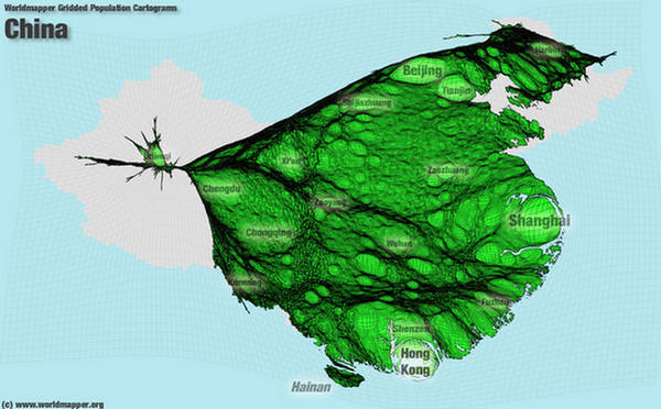
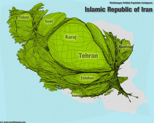
The map below shows the distribution of the Earth's population, with the size of each territory showing the relative proportion of people living there. India, China and Japan loom large as they have the largest populations. Britain bulges beyond recognition while Australia, one of the world's largest countries, is relegated to pipsqueak status.
Population Map Australia

Individual maps of countries tell the same story, with London, Sydney, Paris and Dublin all bulging out as the most populated areas. Interestingly, a look at the U.S. map shows a more even distribution of big-name cities, with Chicago taking a prominent place alongside New York and Los Angeles.
Population Map Bahrain Qatar

Population Map Bangladesh

Population Map Brazil

Population Map China
Population Map Egypt

Population Map France

Population Map India

Population Map Iran
Population Map Iraq

Population Map of Countries - World Map 2
Population Map of Countries - World Map 3